Crossrope App Redesign: Creating a Personalized, Intuitive Experience
The Crossrope app is the digital companion to Crossrope's weighted jump ropes. Rich in features and content, it offers users a variety of ways to work out, track their progress, and stay motivated.
I transformed the previously overwhelming app experience into one that's clean, personalized, and intuitive through research, testing, iterative design, and post-launch refinements. The result: 79% user approval, 47% higher engagement with the goal feature, and users who can finally find what they need.
My Role
Lead Designer & Lead Researcher
Team
1 Product Manager, 2 Developers, & 2 Jump Rope Trainers / Community Managers
Timeline
June - August 2024; January - February 2025
Table of Contents
Users found the app overwhelming and impersonal, and the app's feature set had outgrown its organizational structure
I designed a cleaner, more personalized experience that users love, overhauled the organizational structure, and created a robust, intuitive navigation system
Analysis of user feedback revealed the top features users wanted to see upon opening the app
Potential concepts I explored, like circular progress bars and a 'For You' tab, and why they didn't work
How I iterated on key design elements in response to user testing
Data from surveys and app analytics showed a 79% approval rate for the new design, plus a 47% increase in users tapping on Monthly Goals, and a 16% increase in users doing a recommended workout from Home
Refining the button bar and visual hierarchy based on user feedback and app usage analytics
Problems & Solutions
Understanding the Problems
We analyzed feedback from user interviews, surveys, and analytics, revealing three critical issues:
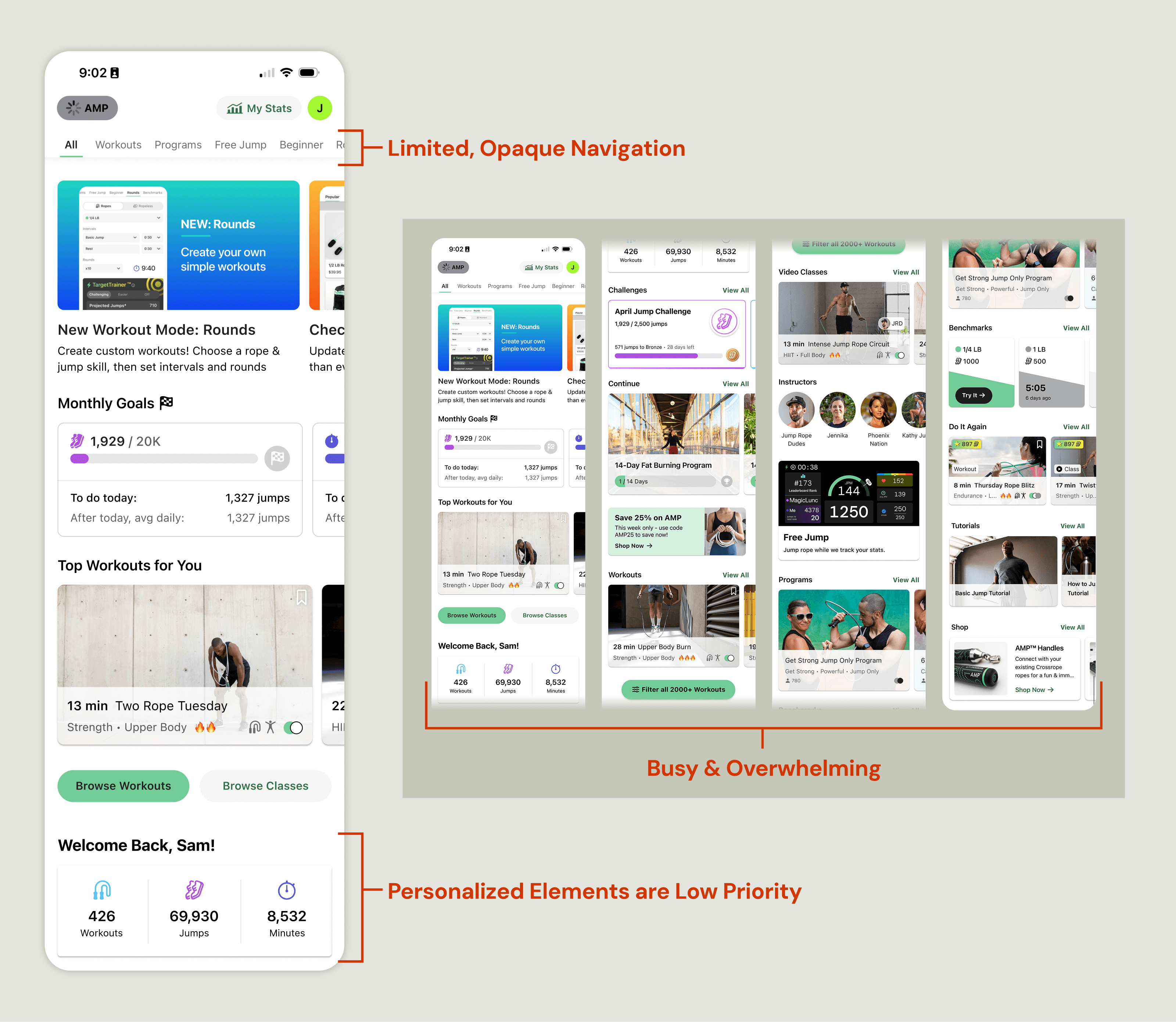
Overwhelming
Users felt overwhelmed by the amount of options and busy interface, and this feedback was particularly common among new users. This cognitive overload was creating unnecessary friction in the app experience.
"The variety is great, but the amount of options are overwhelming"
"The app has loads of features but it seems to be very busy"
Impersonal
The Home screen had evolved to prioritize new content and promotions over personalization. Users felt that it wasn't designed for them, as it failed to address their individual needs or make them feel valued.
"I don't feel it's about me as a person"
"I have to scroll down to see 'welcome back' - why am I seeing this after all the selling crap"
Opaque
The app had outgrown its organizational structure: the feature set had exploded and the infrastructure was no longer capable of supporting it.
Before the addition of the Jump tab, there was no single place to view a list of different ways to work out in the app.
We noticed a trend in user interviews: primary features were generally easy to find, but users often had minimal awareness or understanding of newer features.
Solutions & Impact
90%
task success rate
arrow_upward 47%
increase in engagement with Goals
79%
approval rate
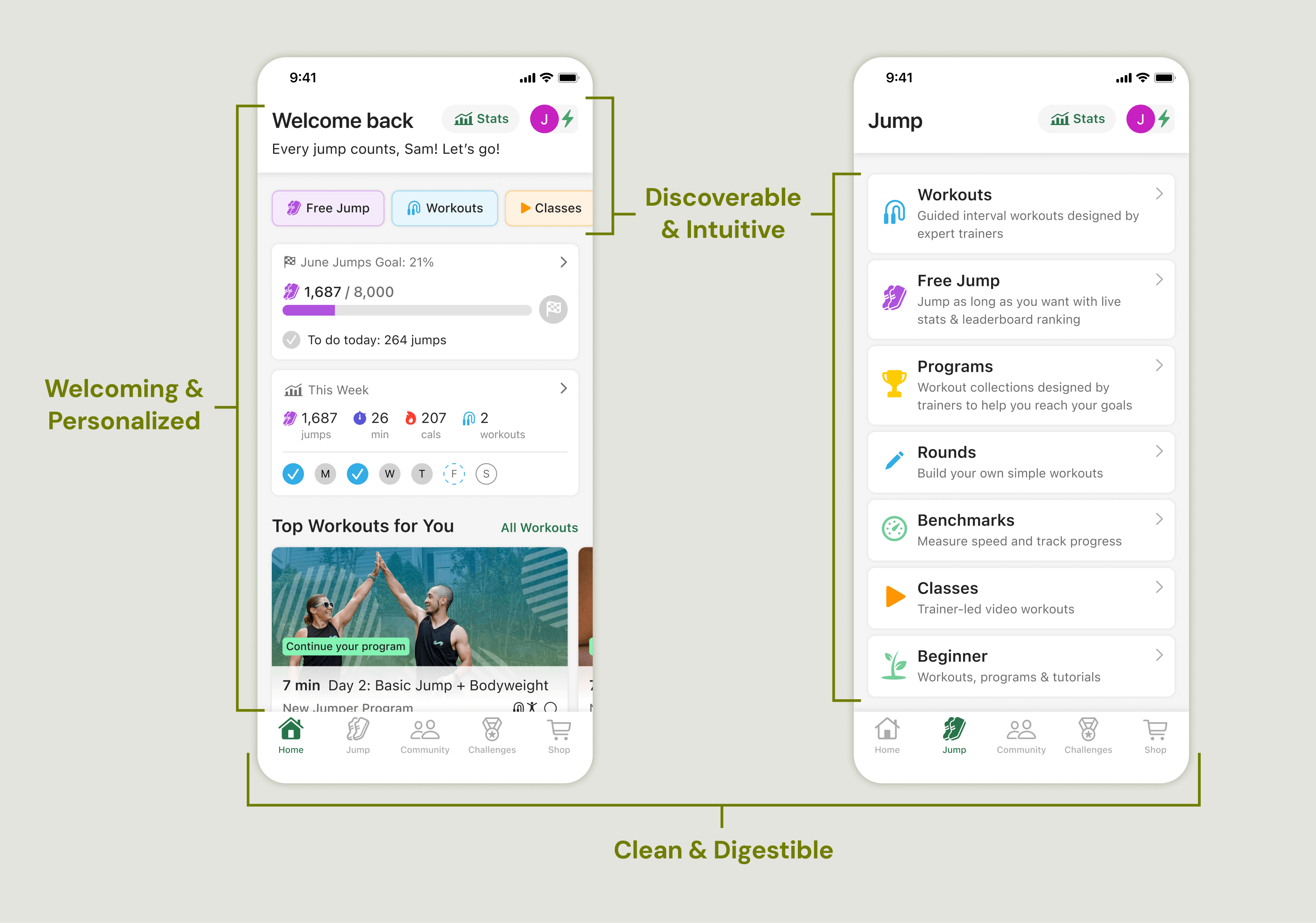
Overwhelming arrow_forward Clean & Digestible
Unified the visual language by applying styles and components from the updated design system I had built, and created clear visual hierarchy with distinct styling for different content types.
"The layout makes more sense"
"It's better organized and cleaner"
Impersonal arrow_forward Welcoming & Personalized
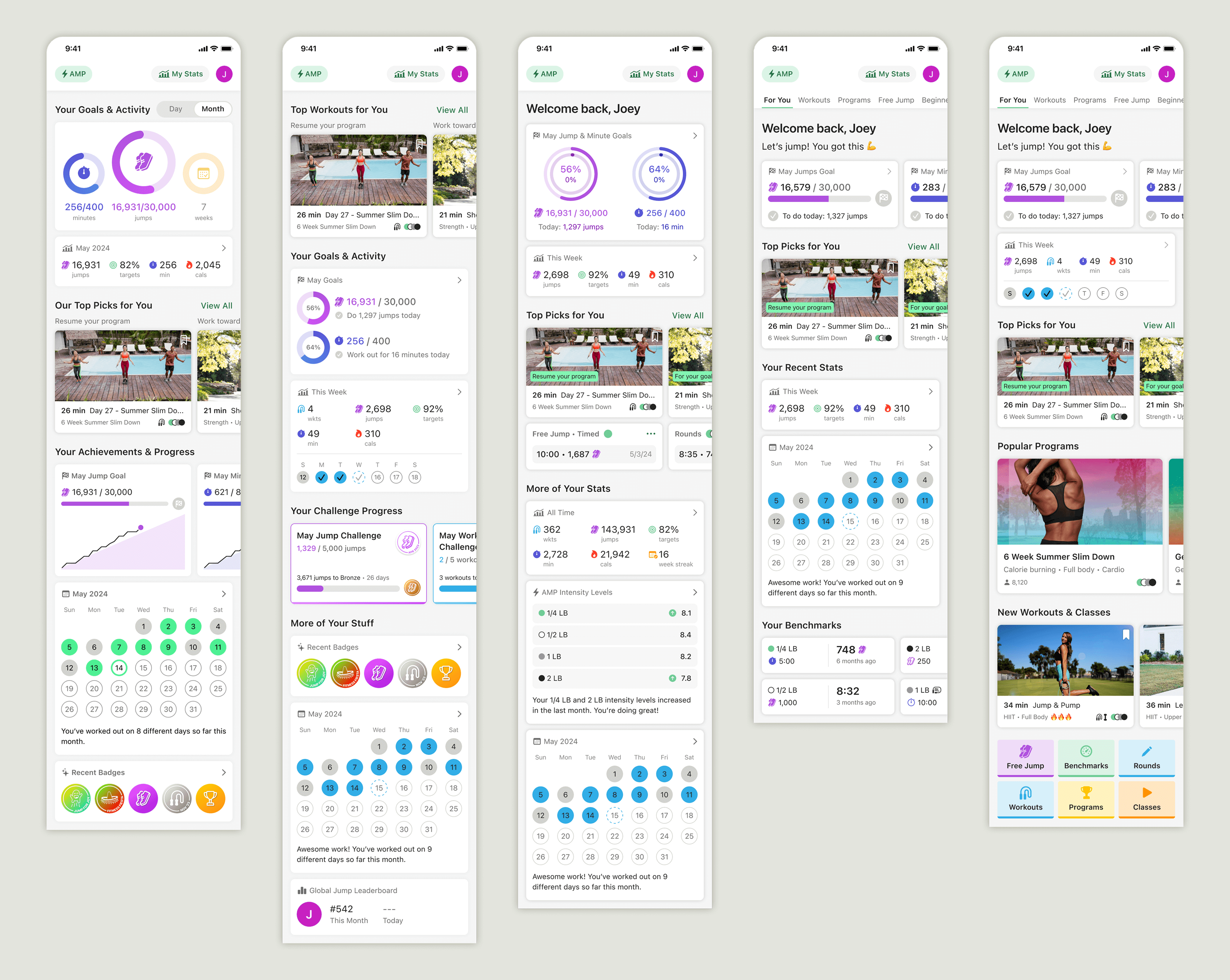
Prioritized the user greeting and placed the top three user-requested elements (Goals, Stats, Workout Recommendations) above the fold, creating an experience that instantly felt personal.
"Love to have easy access to my info - days, jumps, etc"
"I like the display of my goals on the homepage"
"I love that my suggested workouts are right there"
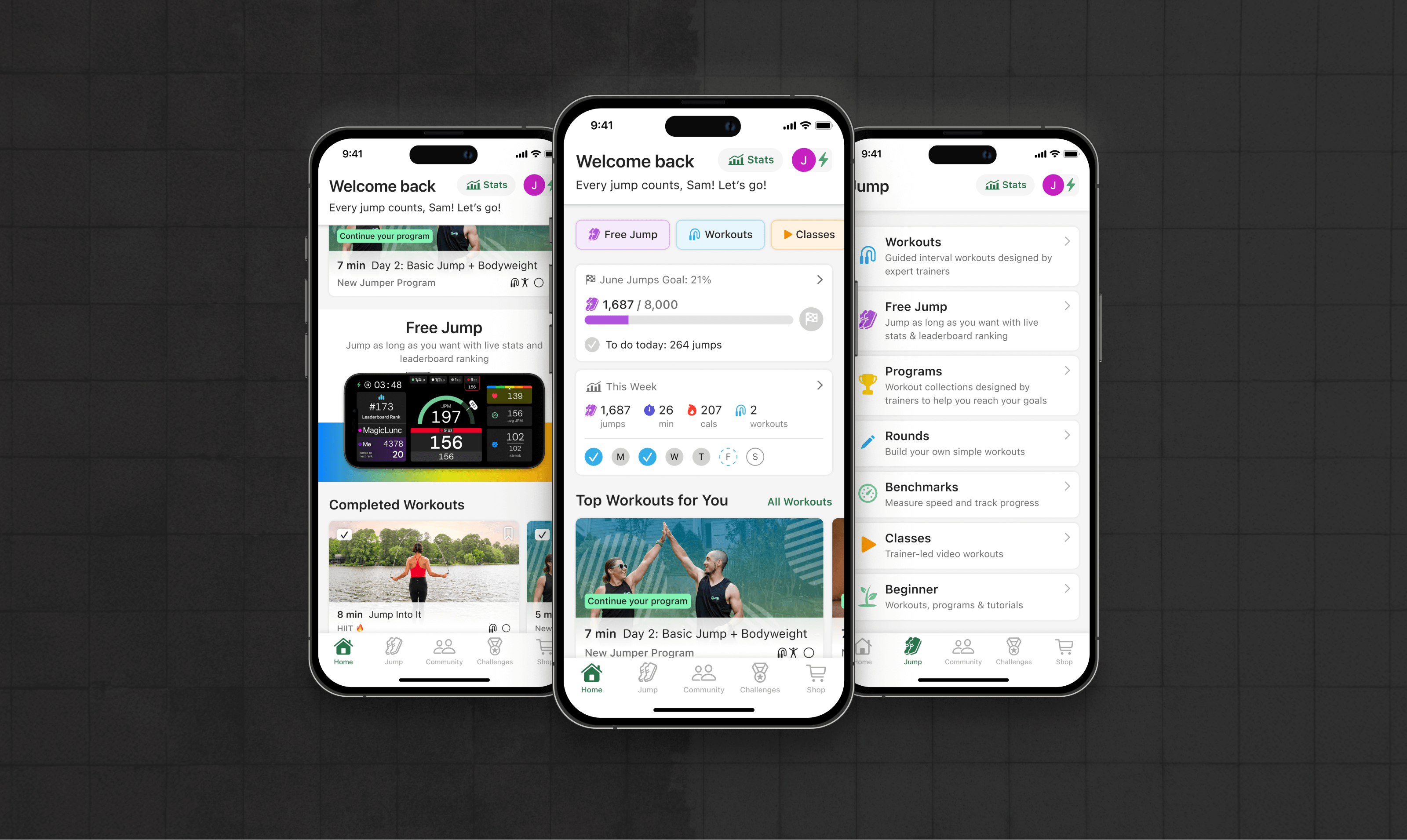
Opaque arrow_forward Discoverable & Intuitive
Created a robust dual navigation system with:
- A dynamic button bar that reorders based on user activity
- A directory of features with clear descriptions in the new Jump tab
"The new menu from the 'Jump' button is so much better"
"The format of the 'Jump' page in list form is clean and easy to use"
Process
Discovering What Users Want
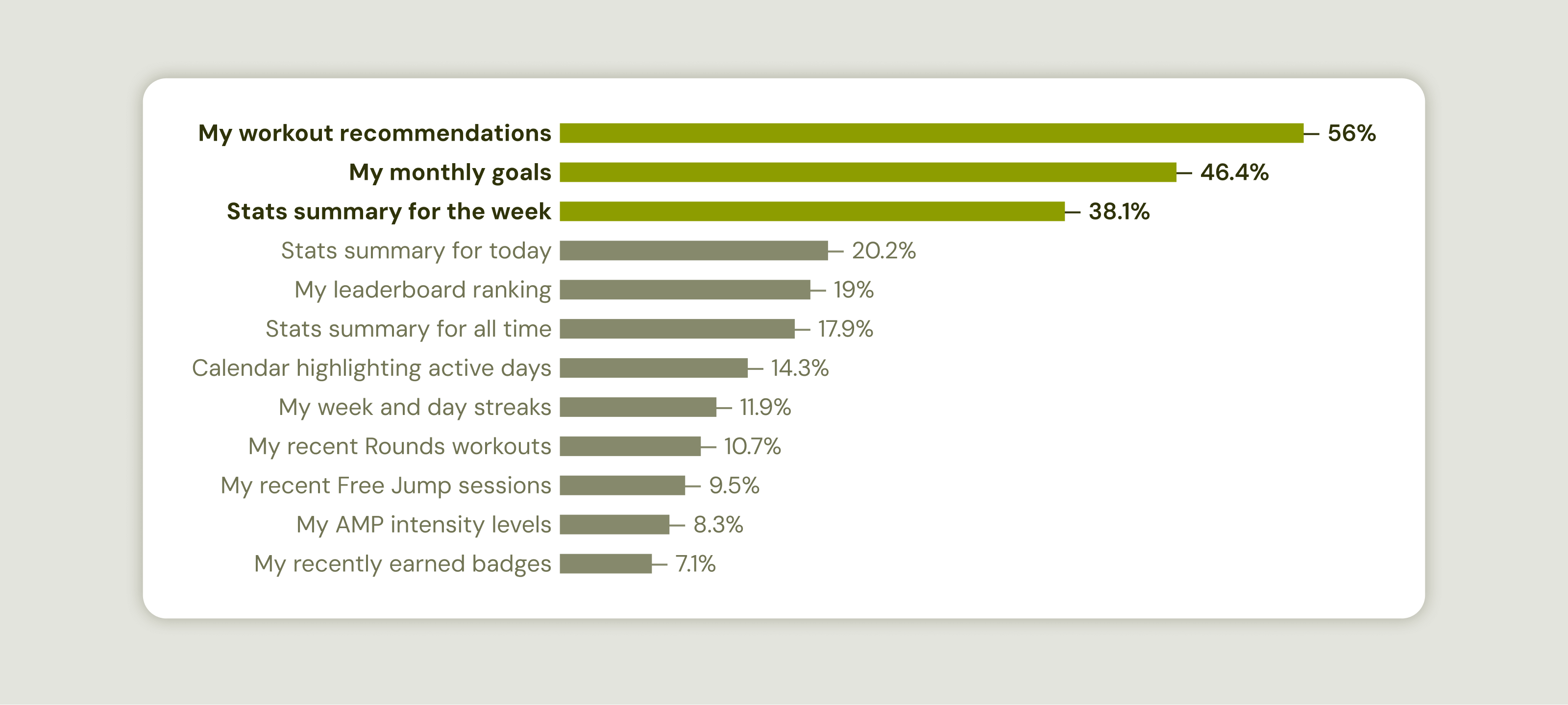
Based on survey results, the top 3 items that users want to see on the Home screen are:
- Workout recommendations (56% of respondents)
- Monthly Goals (46% of respondents)
- Stats Summary (38% of respondents)
Exploring Early Ideas
Armed with insights from user interviews and surveys, I began iterating on potential design solutions to present to the team for discussion. These are two of the concepts that we ended up cutting:
The 'For You' Tab
The For You tab would primarily be a hub for a user's stats and activity trends, plus in-progress programs and recommended workouts.
Why I Designed It This Way
The primary tab would be heavily focused on the user, displaying their stats first and foremost, while still offering some quick workout options.
Why It Didn't Work
There was enough engagement with the workout content in the existing primary tab that it was too risky to remove it in favor of additional stats. Plus, building out the components for all of those new stats would have required a level of development effort that was out of scope.
The last mockup above shows how the design began to evolve back toward including more workout content rather than a variety of user stats.
Takeaway
Data is incredibly valuable when making design decisions! Analytics revealed that the workout content I considered removing actually had much higher engagement than we originally thought.
Circular Progress Bars for Goals
We already had Monthly Goals, and the idea was to give users a daily 'mini-goal' to help them stay on pace for the month, using circular progress bars to visualize it in a way that is familiar and engaging.
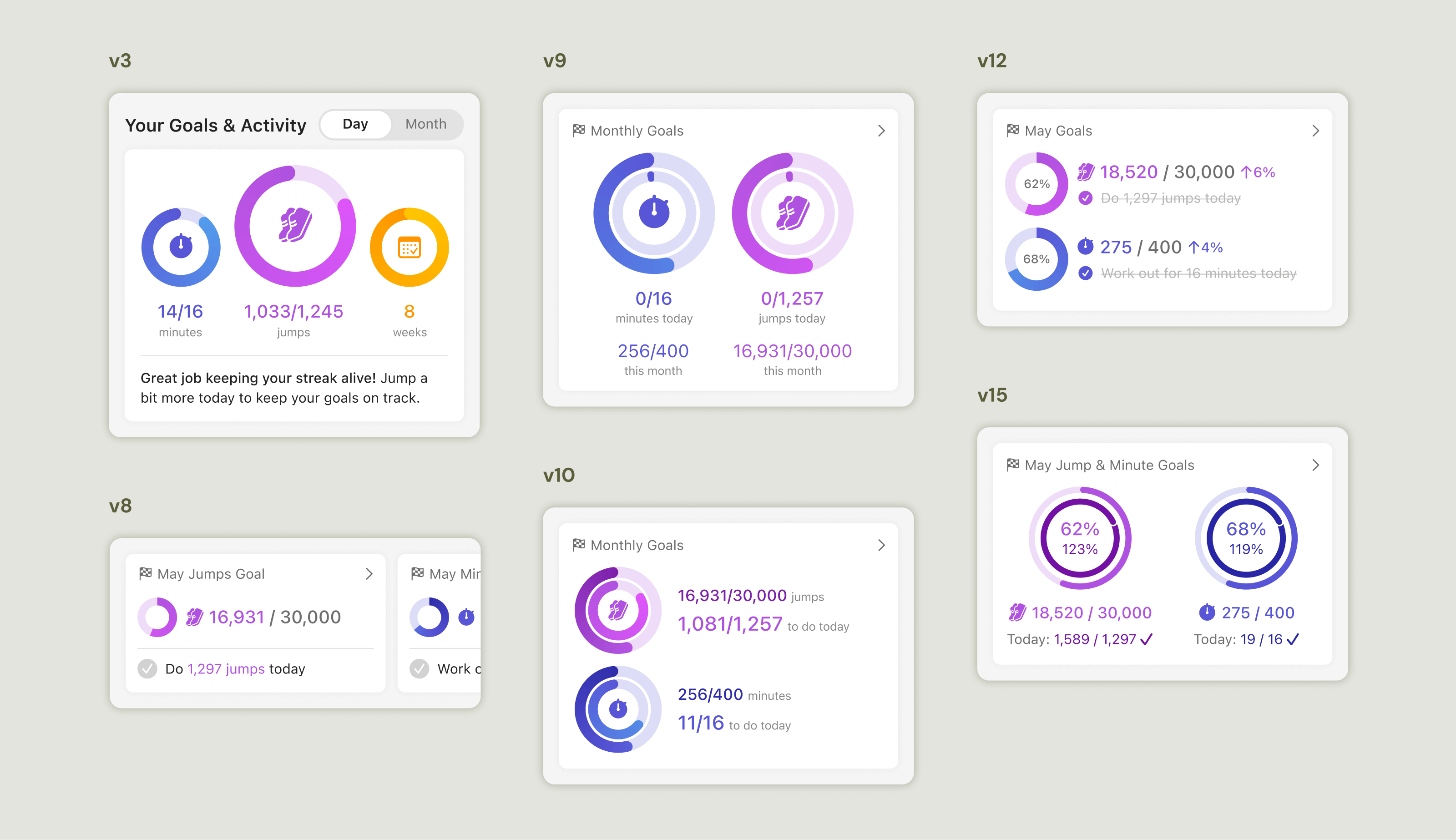
Why I Designed It This Way
Circular progress bars dominate digital fitness experiences because they're satisfying to complete and offer a key benefit lacking in horizontal progress bars: showing progress that exceeds 100%. This would have been valuable as it's common for Crossrope's users to surpass their goals.
Why It Didn't Work
After exploring multiple variations of this concept, it became clear through internal reviews that the 'mini-goal' idea was just too confusing. The design didn't have the same impact when it was for the monthly goal as a whole, since the incremental progress wouldn't be visible like it would be with daily goals.
Another factor was vertical space: Our app needed to work on various devices, including tiny SE1 iPhones, making vertical space on the Home Screen a precious and limited commodity. We had to prioritize keeping users' top three requested elements above the fold across devices, and we couldn't justify having Goals consume as much vertical space as it would need to look its best.
Takeaway
Internal review and discussion can be a great form of pre-user testing. If people with all of the context in the world are confused, users probably will be too.
Test, Iterate, Repeat
I created a prototype and did several rounds of user testing, iterating as I went based on feedback and observations.
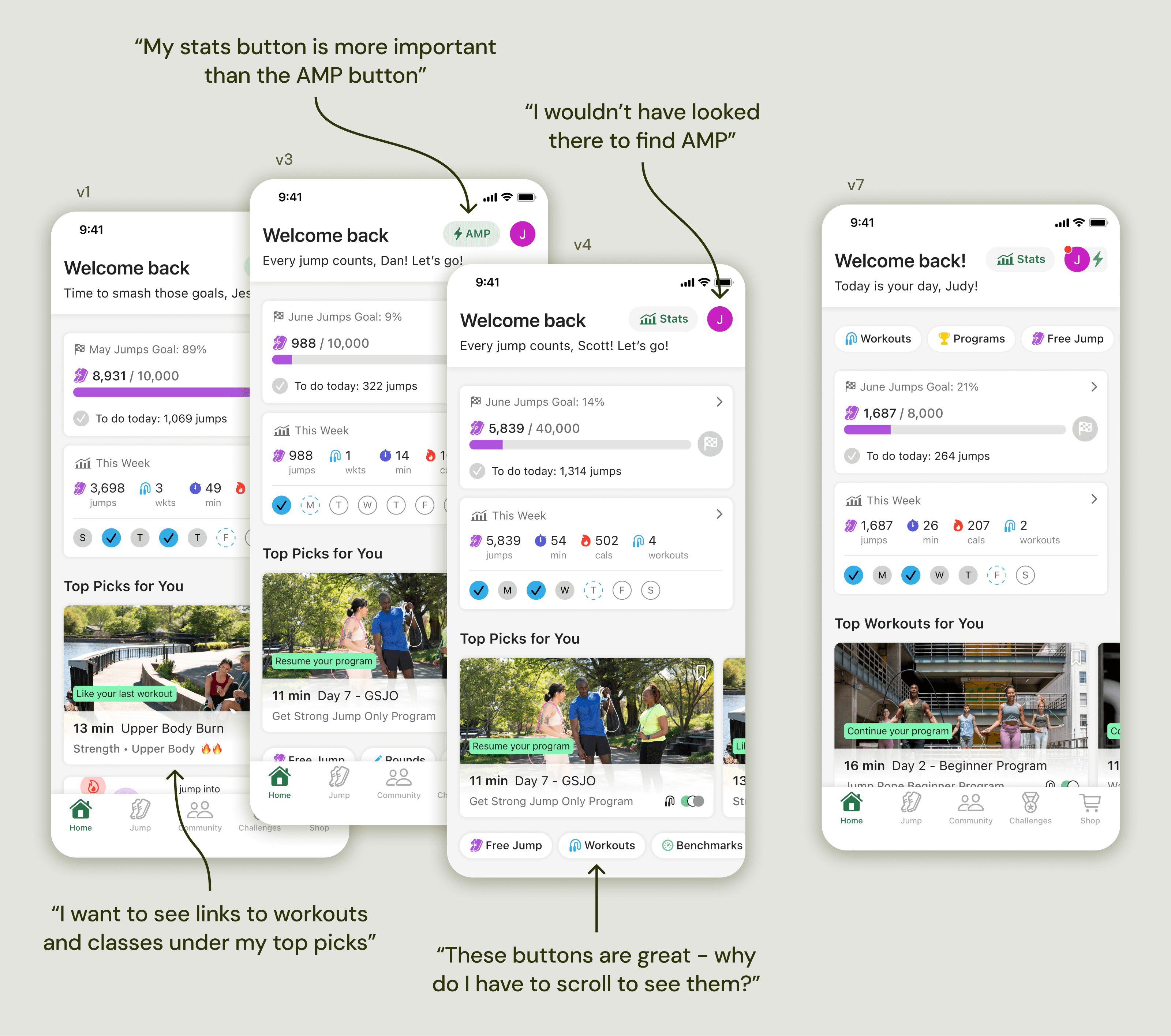
The Button Bar
In the first design that I tested, I did not include a button bar as navigation on the Home screen.
Why I Designed It This Way
Jump Tab: I was planning for the Jump Tab to be the primary form of navigation, and the secondary form would be 'View All' buttons for each section of content on the Home screen.
Minimal: I wanted to keep the UI clean and free of distractions.
How I Iterated
Adding the Button Bar: The first tester wanted "quick links" on the Home screen, and I realized that the old segment control had value, it just needed to be improved. The solution: a fresh new button bar that reorders dynamically based on user activity.
Moving the Button Bar: I initially placed the button bar below the top three sections so it would be accessible, but not distracting. Testing revealed that users would prefer it at the top. I broke a familiar pattern, and users helped me see that it wasn't an upgrade.
Takeaway
Patterns are patterns for a reason: users understand and expect them. It's okay to break them sometimes, but there must be an incredibly compelling reason to do so.
Nav Buttons for Key Features
In the old design, the top nav bar contained 3 buttons: AMP, Stats, and Profile. In the new design, there was only room for 2 buttons. I initially kept AMP and Profile buttons, removing Stats.
'AMP' refers to Crossrope's AMP Handles, which are Bluetooth connected jump rope handles. They enable real-time jump counting and speed tracking.
Why I Designed It This Way
Easy Bluetooth Pairing: The process of pairing AMP handles for the first time had to stay seamless, and keeping it in the nav ensured high visibility.
Redundant Paths to Stats: The new Stats cell on the Home screen opens the Stats page, and there's also a button to open it from the Profile menu.
How I Iterated
Listening to Users' Priorities: During testing, most users didn't intuitively know to open Stats by tapping on the cell on Home. Plus, all users said they would prioritize the Stats button over the AMP button.
Keeping AMP Discoverable: I tested a version with no visible AMP symbol, and some users struggled to find it in the profile menu. I added an AMP icon next to the Profile button, serving as an access point and status indicator.
Takeaway
Balancing user needs and business priorities is a key part of my job, and getting early and frequent feedback from stakeholders and users is crucial to making sure I get it right.
Release
Impact
Survey results, user feedback, and analytics validated that the redesign massively improved the app experience. Users told us the app felt more personalized and intuitive. We also noticed increased engagement with Goals, Stats, and workout recommendations.
90%
task success rate
arrow_upward 47%
increase in engagement with Goals
79%
approval rate
Post-Release Improvements
Though the release was a huge success, there is always room for improvement. About six months after the release, we had plenty of analytics data and user feedback to inform our decisions about what to improve and how.
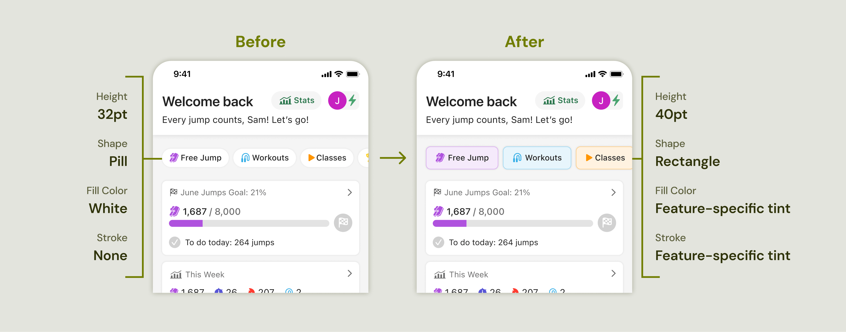
The Button Bar
Insights & Iteration
Unexpected Trends: We thought the button bar would be the primary navigation method, but analytics revealed the opposite: most users were using the Jump tab to navigate to workout modes.
Understanding Why: I did some interviews and asked users to show me what they do when they open the app. I watched user after user ignore the button bar and open the Jump tab, confirming what our data showed. Most users couldn't explain why, and some said they hadn't noticed the button bar at all. This suggested the buttons were too small and visually subtle.
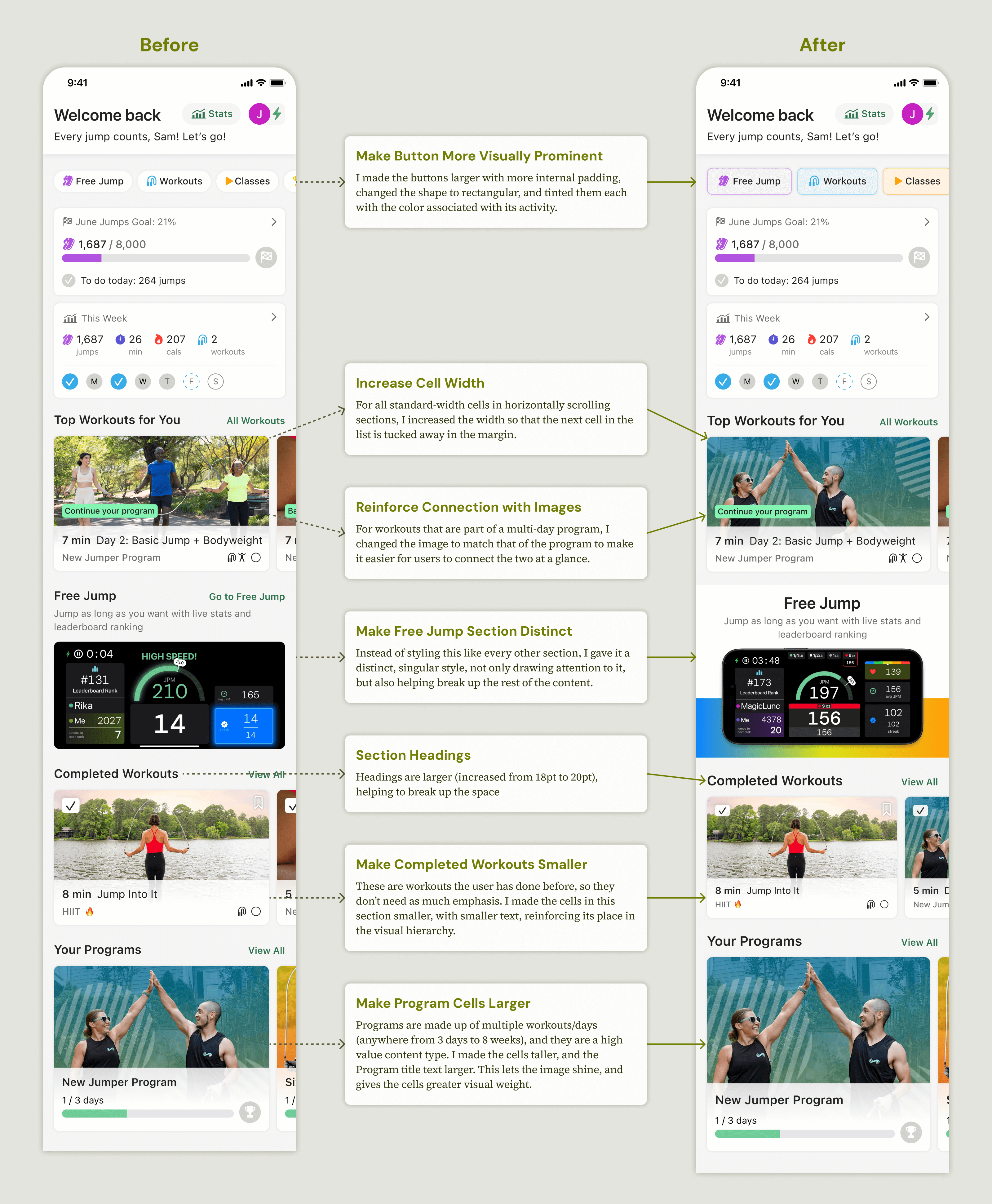
Improvement & Impact: After iterating and releasing an updated design that used more color and slightly larger buttons, usage of the button bar to access the Free Jump feature increased by 48%, with 40% of users now accessing it from the button bar, compared to 27% before the change.
Home Page Visual Hierarchy
Insights & Iteration
Lingering Complaints: User feedback saying that the Home screen was overwhelming decreased substantially after the release, but we still heard it from time to time. I conducted a survey in January 2025 that showed 20% of respondents still thought it was cluttered and/or everything looked too similar.
Understanding & Improving: I was thrilled to finally get to implement a unified component system on the Home screen, as it hadn't been a development priority in the past. In my efforts to unify, I had overcorrected and made distinct pieces of content look too similar to each other. I went back to my designs and made some thoughtful tweaks to distinguish different content types and create a stronger visual hierarchy.
Takeaway
Design doesn't stop upon release. Staying in tune with user feedback, conducting research after the release, and actively considering how to continue improving are all important ways to ensure a product delivers the best experience possible.
Reflections
This project exemplifies my approach to design: listen carefully to users, test rigorously, and always remain open to refinement. The results were increased engagement, higher satisfaction, and a personalized, intuitive product that truly serves its users. If I could go back, I would love to have nailed the visual hierarchy for the first release, but I'm happy with how I initiated the post-release improvements.