Crossrope Teams: Boosting User Engagement & Motivation through Accountability & Connection
The Crossrope app is a jump rope fitness app that offers users a variety of ways to work out. But workouts aren't enough - our team was always looking for ways to help our users have fun with fitness and stay committed to their goals.
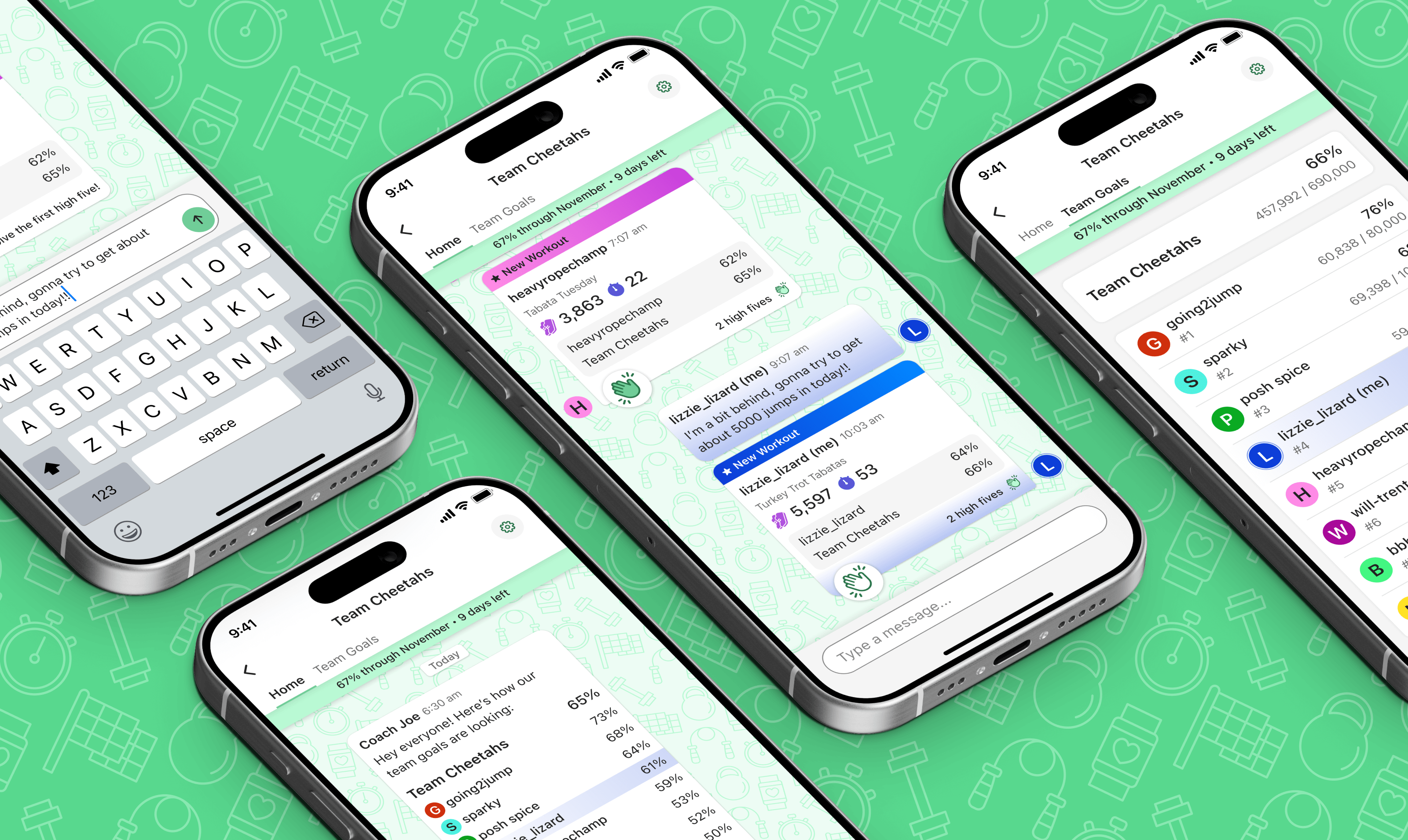
The idea behind Teams was to create small accountability groups that users could join, and they would be placed with users who had similar jump goals to them. Their individual goals were combined into a team goal, with a coach bot providing daily progress updates. Members could chat, celebrate workouts with high fives, and track each other's progress toward goals.
It was an absolute hit with users, resulting in a 77% increase in users setting a monthly goal, 37% increase in users achieving their goal, 33% increase in total jumps per user, and a 19% increase in users setting a higher goal than the previous month.
My Role
Lead Designer & Researcher
Team
1 Product Manager, 2 Developers, & 2 Jump Rope Trainers / Community Managers
Timeline
November 2024 - January 2025
Table of Contents
We aimed to create a powerful motivational mechanism for users through social accountability
Teams led to increased user engagement and a higher rate of users successfully completing goals
The idea for Teams came out of a brainstorming session based on user interview insights
The iterative evolution of a couple of key components
The final version of the primary screens for Teams
See a snapshot of the detailed handoff file I created with numerous screens, states, components, notes, and annotations
My retrospective thoughts about challenges I worked through
Objectives & Impact
Objectives
At Crossrope, we aimed to continuously add value to the experience by developing features that genuinely helped our users make progress, feel accomplished, and stay motivated.
Teams is one of those features - we weren't trying to solve an existing problem, but rather to create an impactful motivational mechanism for our users.
Drive Motivation through Accountability
We wanted Teams to motivate users and help them stay committed to their fitness goals. By combining individual goals to create a team goal, we aimed to give users a feeling of accountability to their teammates, which often proves more powerful than being accountable only to oneself.
Leverage & Boost Existing Goals Feature
Our existing Monthly Goals feature was already a user favorite, and we hoped that introducing Teams and tying it into Goals would create a powerful synergy, leading to a richer, stickier experience that users would find even more engaging.
Increase User Engagement
One of Crossrope's key engagement metrics is the number of jumps users complete per day, week, and month. So, one of our objectives for the Teams feature was to increase both jumps per individual user and the total collective jumps across all users.
Impact
Increased Engagement
Teams had the impact we hoped it would: interest in Goals spiked, users became more likely to achieve their goals, and jumps per user increased as users were more motivated to jump consistently.
arrow_upward 77%
increase in users setting goals
arrow_upward 37%
increase in users achieving goals
arrow_upward 33%
increase in jumps per user
Happy, Motivated Users
Users love the way being on a team motivates them and holds them accountable as they work toward their goal.
81%
of users enjoy being on a team
80%
of users feel more motivated to jump
When we asked users about their experience, we got so many great responses - here are some standouts:
"It keeps me motivated. In my mind, I like to think every workout I do is making my team proud"
"It helps me push myself"
"It is a good reminder to jump consistently. My team provides a gentle form of accountability"
Process
Planning & Validating the Concept
A Concept Driven by User Insights
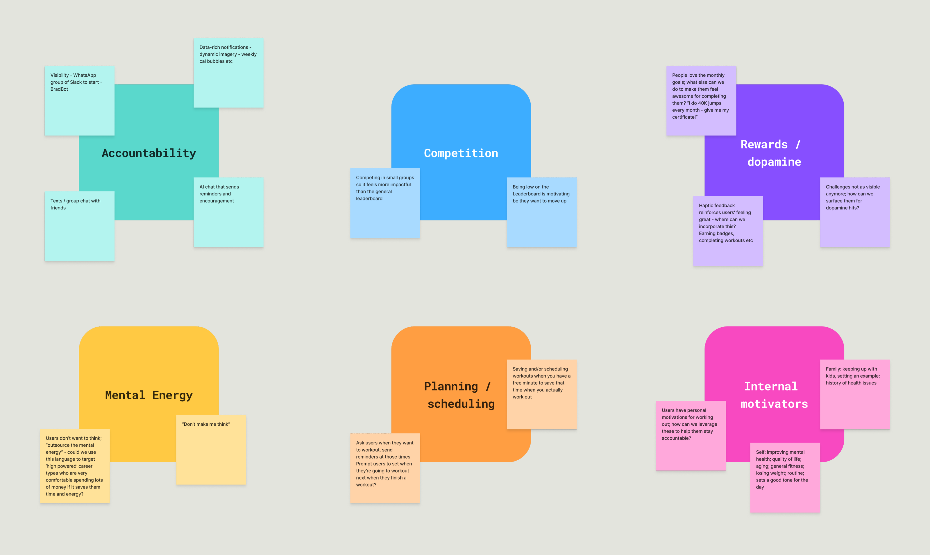
My Product Manager, Brad, and I were having a brainstorming session centered around insights from my recent user interviews. We kept coming back to two key threads: accountability and competition.
Brad brought up the idea of visibility as a powerful driver for accountability and healthy competition. We wondered how a user's motivation might change if others could see their goal and know whether they were on pace to succeed.
We recognized the potential but knew implementation would be crucial. Would users care if thousands of strangers could view their progress? Perhaps not. But what if they joined a small team where 5-7 teammates could see their stats? This created a much more meaningful dynamic in which visibility created a sense of social accountability.
Initial Feature Planning
We tossed some ideas back and forth, and ended up with this initial list of potential features for what we were playfully calling “BradBot” (a nod to the idea that we would have an AI chatbot driving the interactions):
- Others can see your goal progress, and you can see theirs
- Others can see when you exercise (and therefore, when you don't as well)
- Mutual visibility of goals and workouts means that you know that others can see if you're slacking off
- Coach/bot sends messages about team progress, showing if team and members are on or off track
- There could be a mini leaderboard showing how each member is doing relative to their own goal
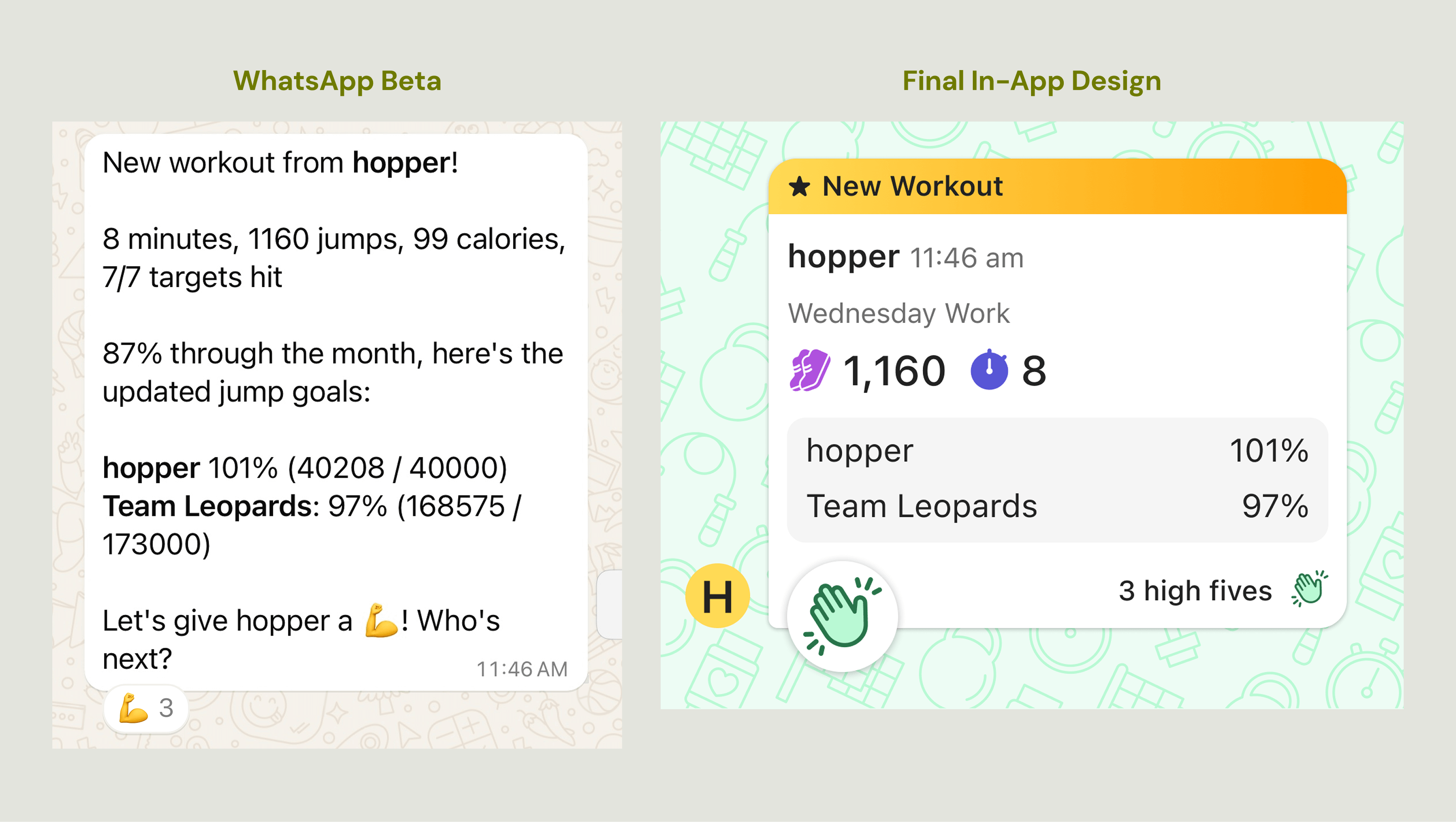
Validating in Beta
We launched a Beta version of Teams using WhatsApp so we could validate the idea. Our Product Manager, Brad, spearheaded this beta test to protect design and dev resources until we confirmed the concept's viability.
We recruited participants for the test, and Brad created the first version of the coach bot (not a true AI, but an automated messaging system with logic-driven responses) and assembled teams based on users' goal similarities.
The test was a huge success: users were enthusiastic and reported feeling more motivated to jump consistently and achieve their goals. This validation gave us the confidence to invest more deeply in the feature, and I began transforming it from its rough beta state into a polished, compelling in-app experience.
Design Evolution
I started exploring how the Teams experience could look and function. Here's how key a couple of key components evolved from initial mockups to the final product:
Team Preview Cell
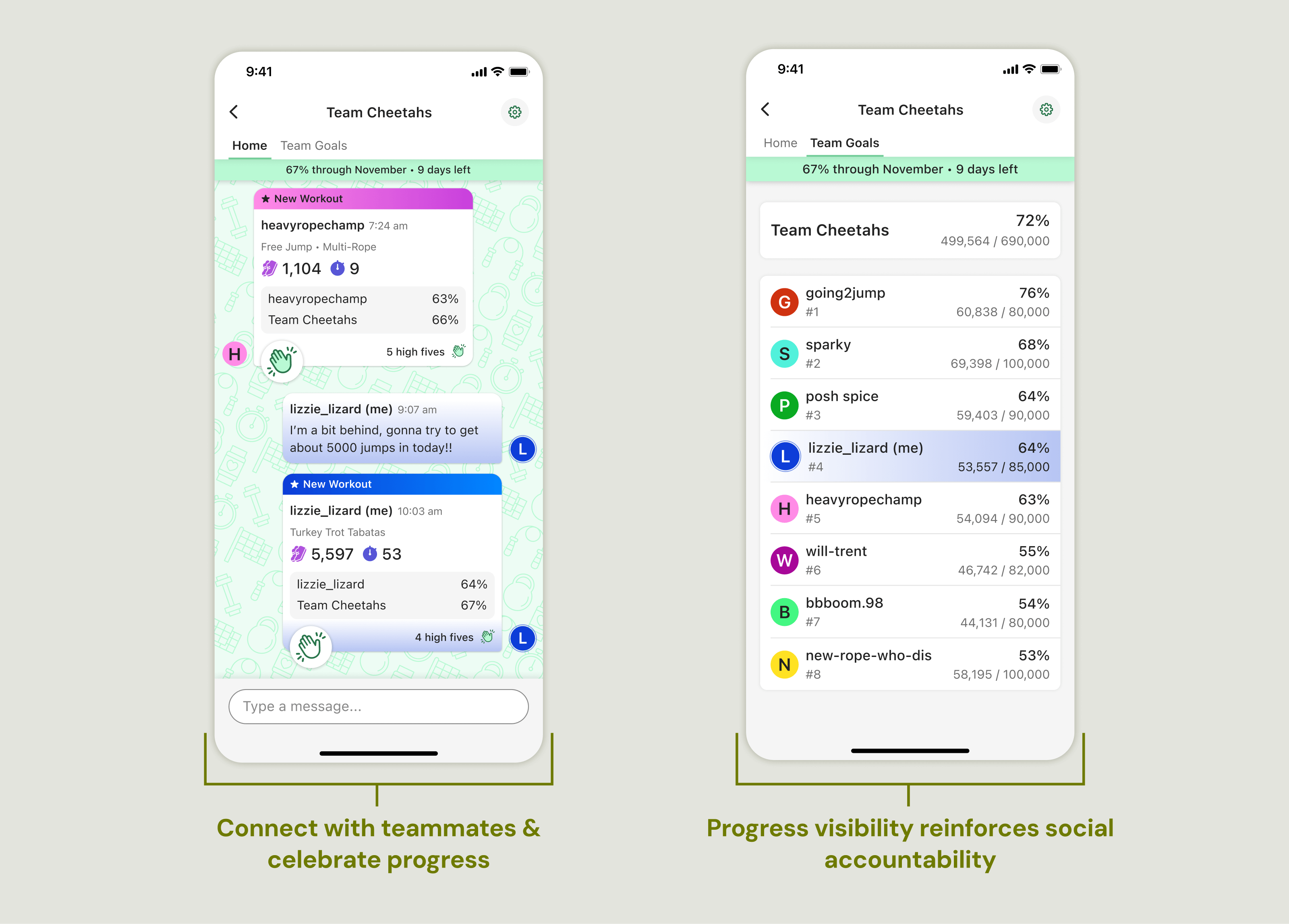
The Team Preview Cell lives in the Teams segment of the Community tab. Tapping on it opens the chat/home for a single team.
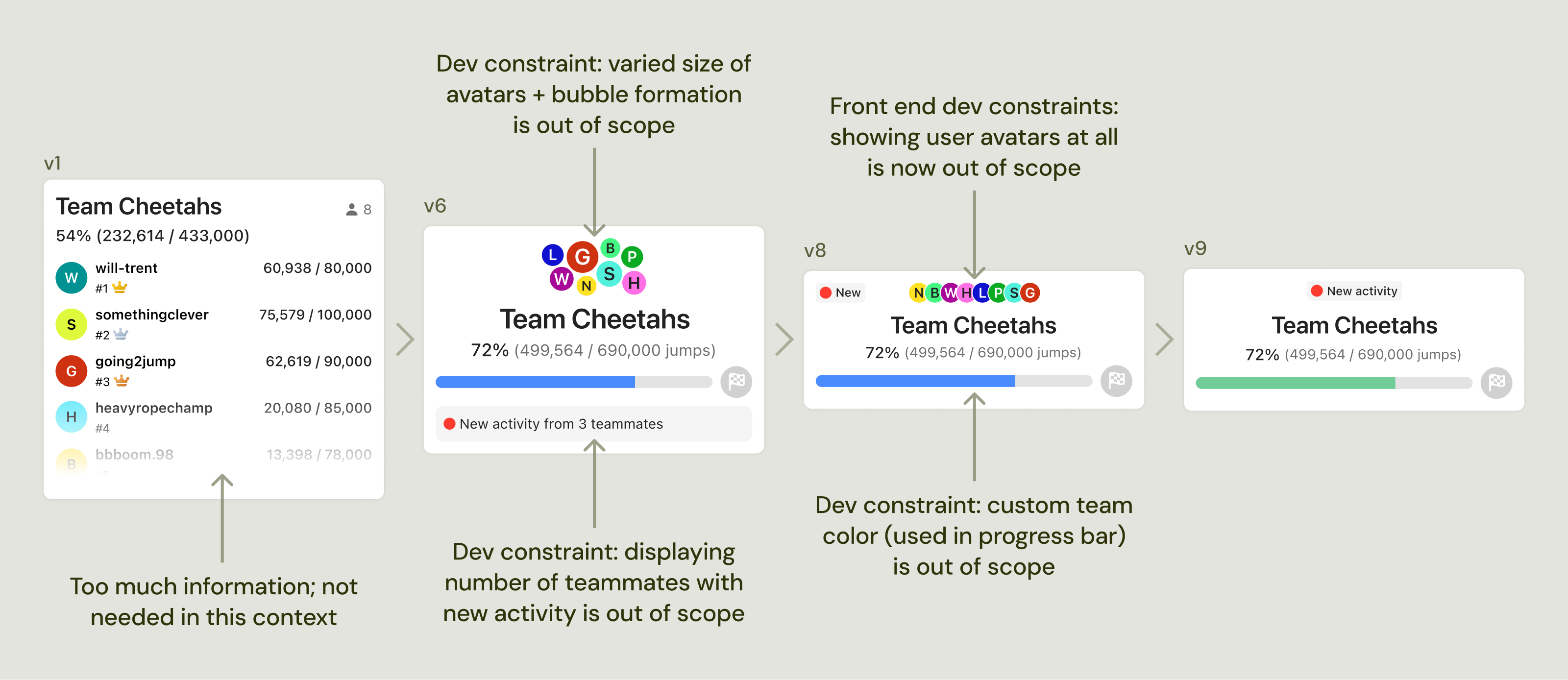
There were a number of development contraints that drove major design changes for this component. The project had so much complexity that we had to look for ways to compromise on design elements to save development time and effort.
Workout Message Cell
The Workout Message cell contains a user's workout stats, and is sent to their team chat whenever they do a new workout.
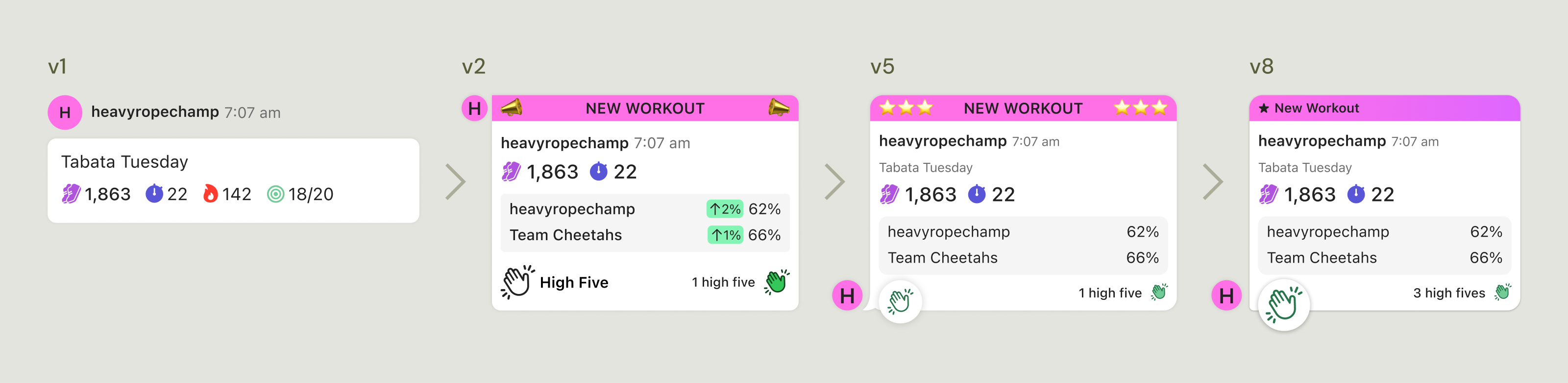
I iterated extensively on this cell over the course of the project. It has so many pieces within it, and I had to balance showing enough data to make it feel relevant and interesting, but not show so much that it's busy and overwhelming. I also wanted to make sure that it felt exciting - this user did a workout! They're making progress toward their goal! I go into detail about how I iterated between the versions below.
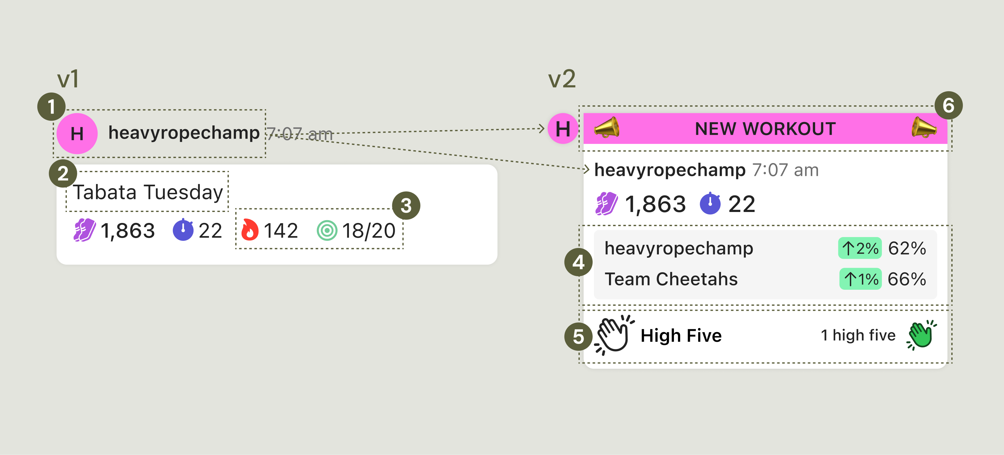
From v1 to v2
- Put username inside cell and move avatar to beside the cell. When the username is contained inside the cell, the UI feels cleaner since it's all grouped together.
- Removed the workout name ("Tabata Tuesday") because I didn't think it was important enough to include in this context. I later added it back after hearing from users and stakeholders that they considered it relevant in this context.
- Removed secondary stats (calories burned and targets hit). Jumps and minutes are the most relevant stats, and I wanted to cut down on extraneous info.
- Added updated goal progress info. When a user does a workout, they are furthering progress toward their personal goal and the team's goal. We wanted to show the updated goal completion percentage to reinforce the user's contribution by doing this workout.
- Added the high five button so teammates can cheer each other on.
- Added the NEW WORKOUT heading. It was important that each new workout felt like an exciting accomplishment, because it is! This element went through a lot of iteration before I was happy with its appearance. I cringe a bit looking at the early versions!
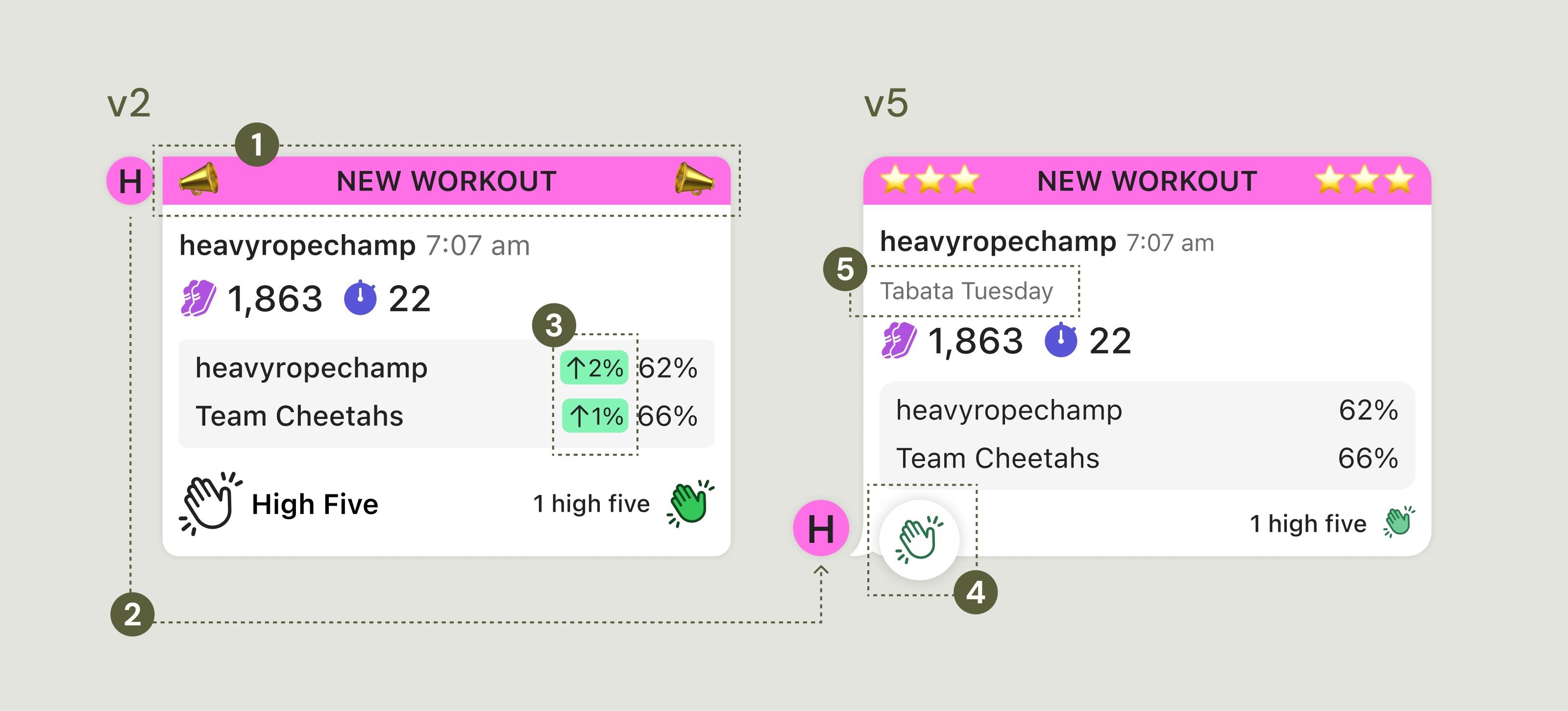
From v2 to v5
- Iterated on the NEW WORKOUT heading. Still not there, but getting closer.
- I needed to make the cell look more like a message bubble in a chat. I added the classic 'swish' that makes a speech bubble look like a speech bubble, and moved the user avatar to the bottom.
- Removed the % change highlighted in green. This indicates how much of an impact the workout had on the user's goal and the team's overall goal. While people appreciated this info, it wasn't essential, and it made the cell too busy.
- I wanted the high five action to stand out more, so I enclosed it inside a separate container layered on top of the cell.
- Feedback indicated that users were interested in knowing the name of the workout in this context, so I added it back.
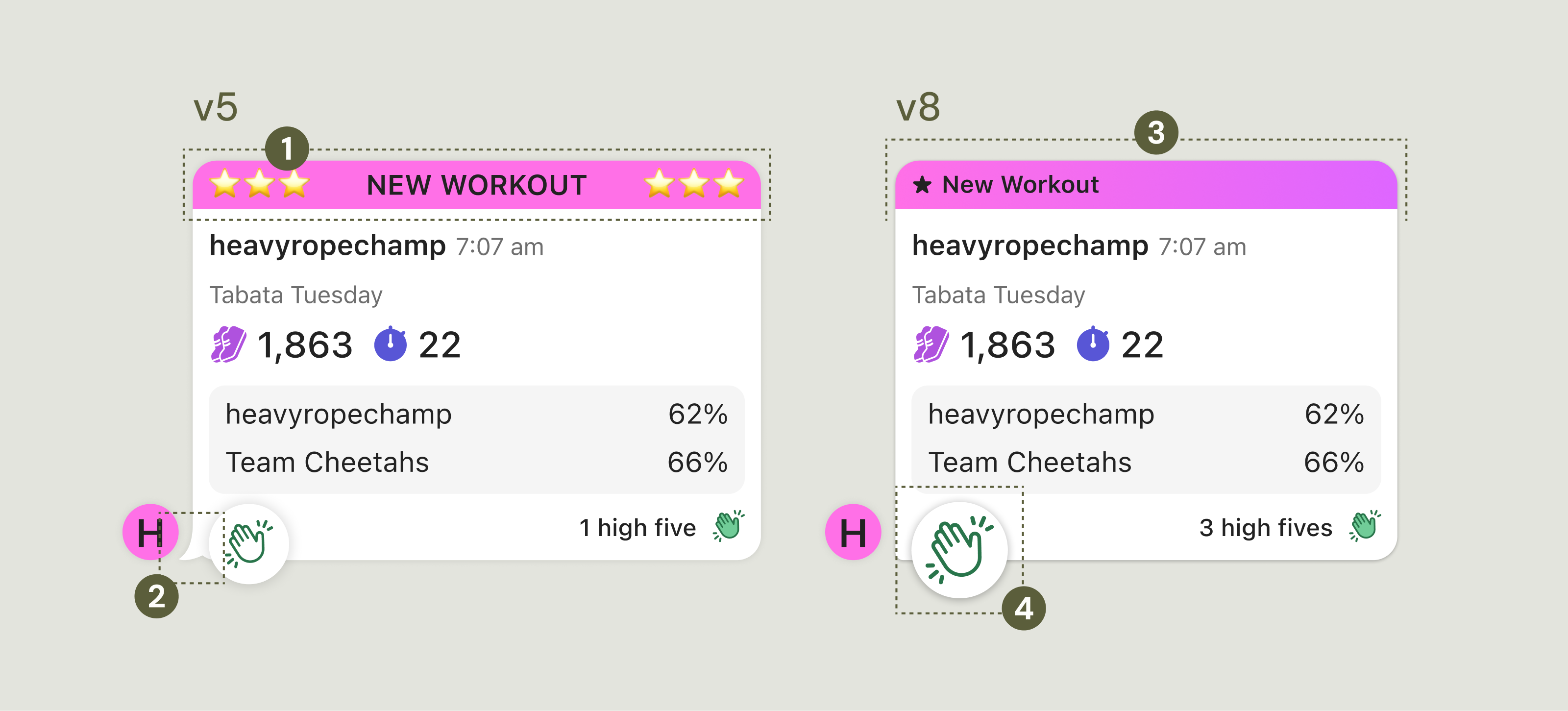
From v5 to v8
- Iterated on the NEW WORKOUT heading, and finally got the execution right. In retrospect, I was trying too hard to make it ~fun~ and completely missed the mark in doing so. I got some great feedback a team member that was exactly the gut punch I needed: "It kind of looks like a cheesy website from the 90s" - oof. But it was true, and I was so grateful for his honesty. It helped me realize I had strayed too far from the app's aesthetic in a misguided effort to make it stand out.
- The speech bubble swish didn't make the cut, unfortunately. It was out of scope as it would require too much development effort. Instead, I applied a smaller radius to that corner to somewhat mimic the effect of the swish.
- I reduced the width of the cells to match other messaging apps.
- Our Product Manager, Brad, loved the high five button, and wanted it to be bigger. I made it bigger, thinking it was going to be too much - but it wasn't. The larger size helps it compete with the larger cell it's attached to.
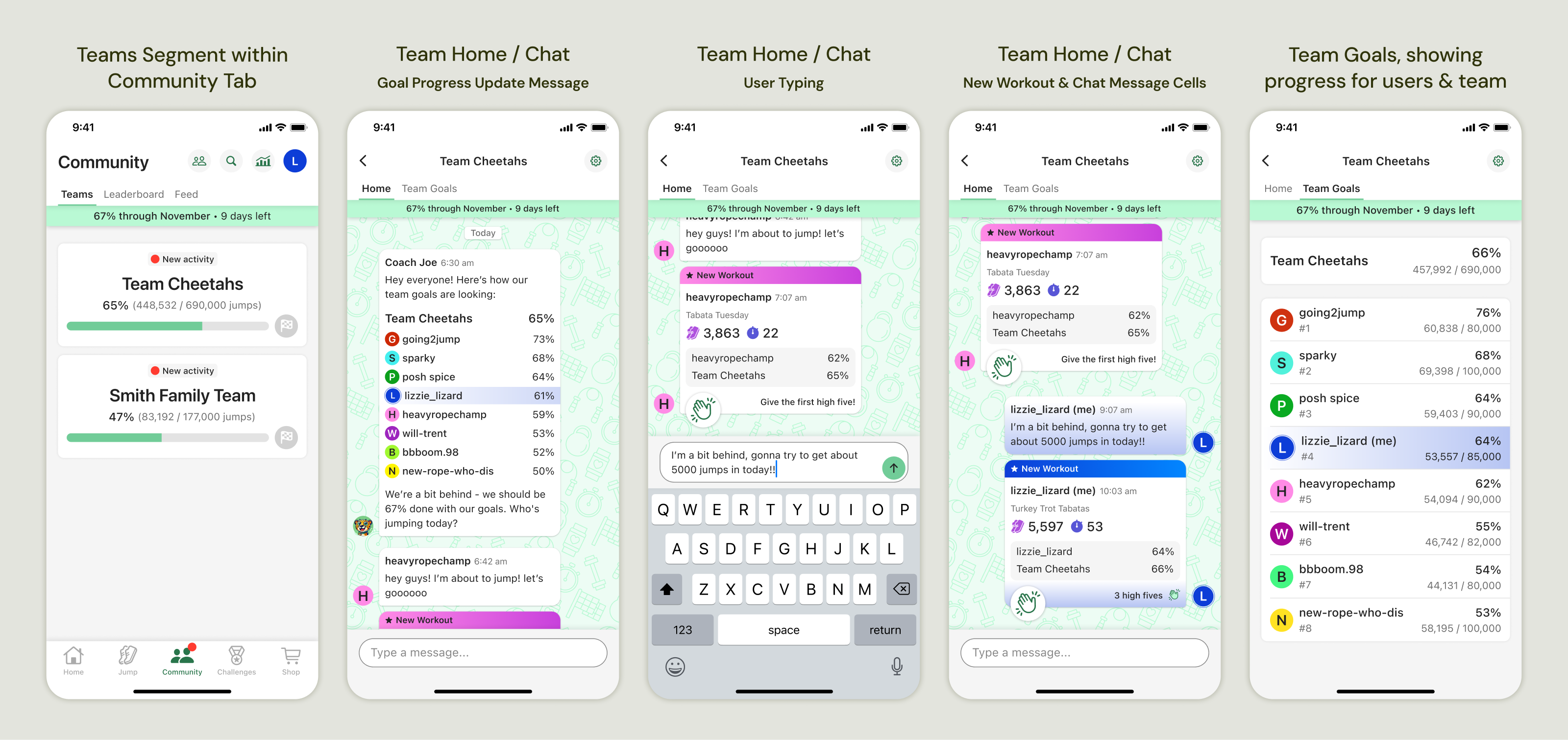
Final Designs
Over the course of numerous rounds of feedback and iteration, I developed the final screens and flows. Here are the primary screens/states:
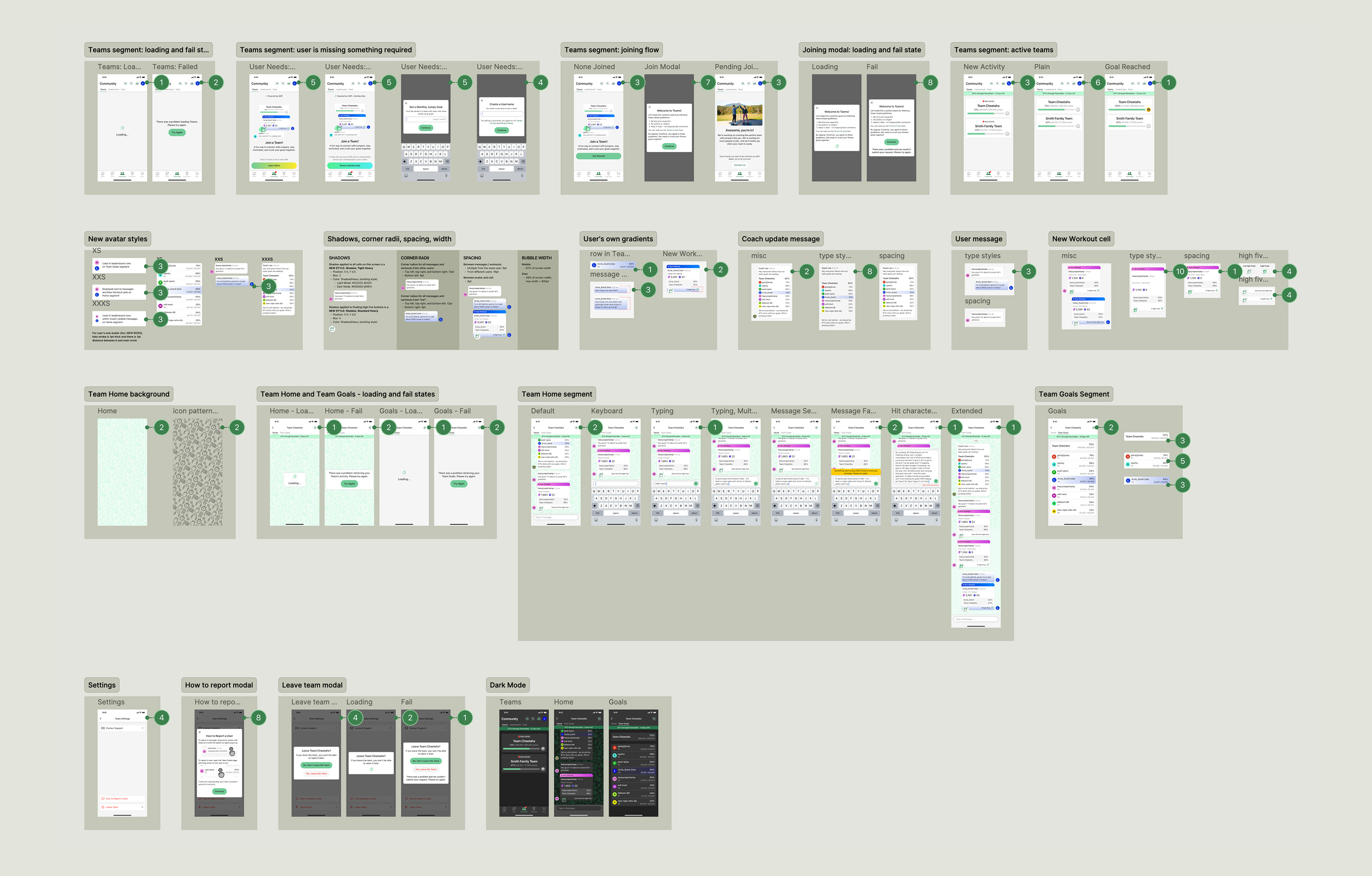
Design to Dev Handoff
Once I had finalized the designs (for the first release, at least), I organized everything into a detailed handoff file. The file includes every screen in the flow, loading and fail states, notes about new components and styles, and annotations for type styles, colors, spacing, and other details.
Reflections
I ran into numerous dev constraints while working on this project. It was massive in scope, and as a lean team, we had to look for ways to simplify. Even with all of the compromises, the feature created so much value for users. It underscores the importance of being flexible; I'm not an island! I'm part of a team, and we are part of a business, and that comes with limitations and competing priorities. Things change as projects progress, and I have to stay open and willing to respond to chose changes.