
Drizzle: Designing a Specialized Recipe App with Accessibility at its Core
Drizzle is a conceptual recipe product I created as a student. The brief was pretty broad; the primary direction was to create some kind of recipe product. I decided to narrow my focus down to a niche category: sauce.
My Role
UI/UX Designer & Researcher
Timeline
October - December 2020; April - May 2021
Process
Research & Planning
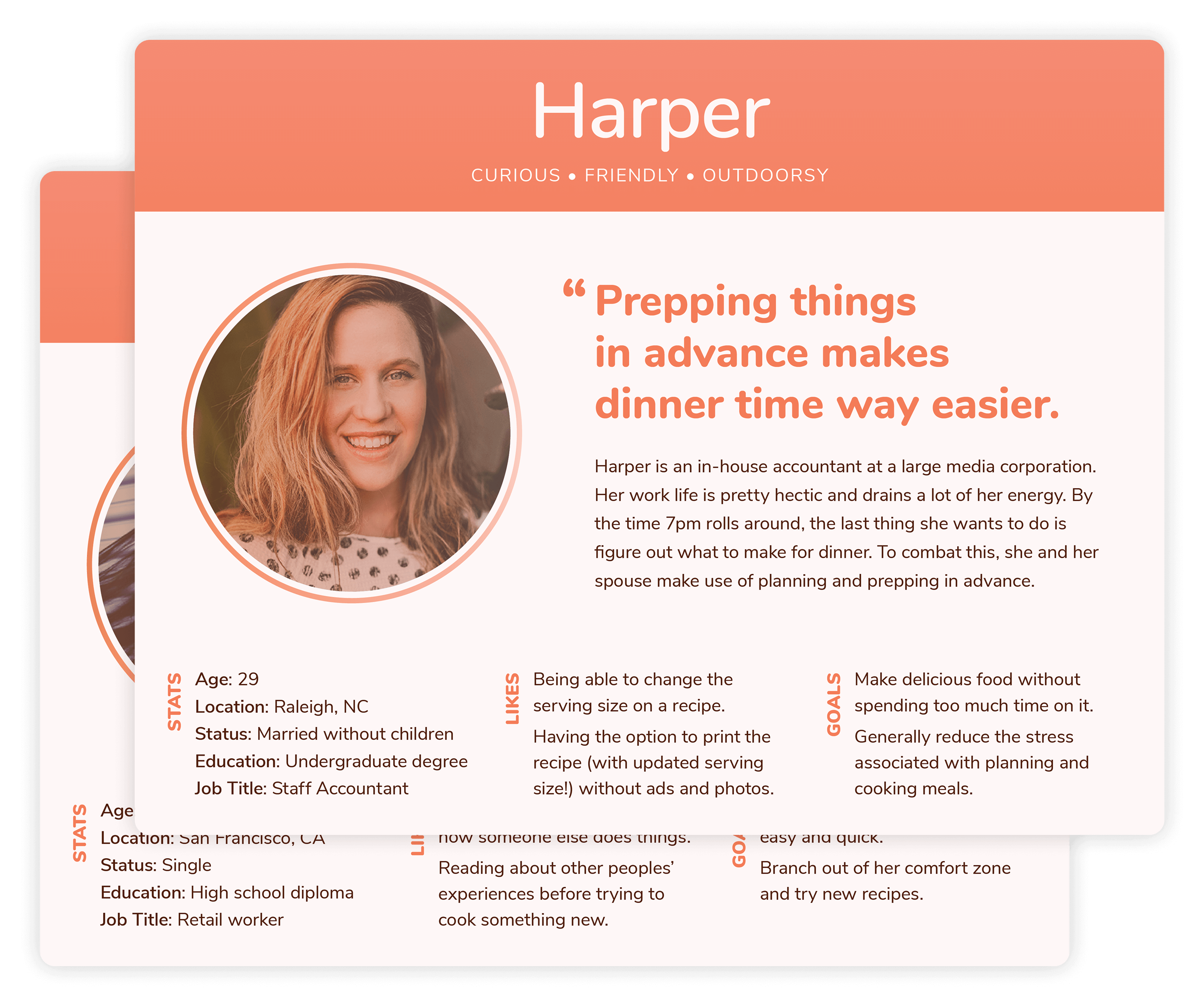
User Interviews & Personas
I interviewed several potential users during the UX research stage. I used the information from these interviews to create user personas that helped guide my design decisions.
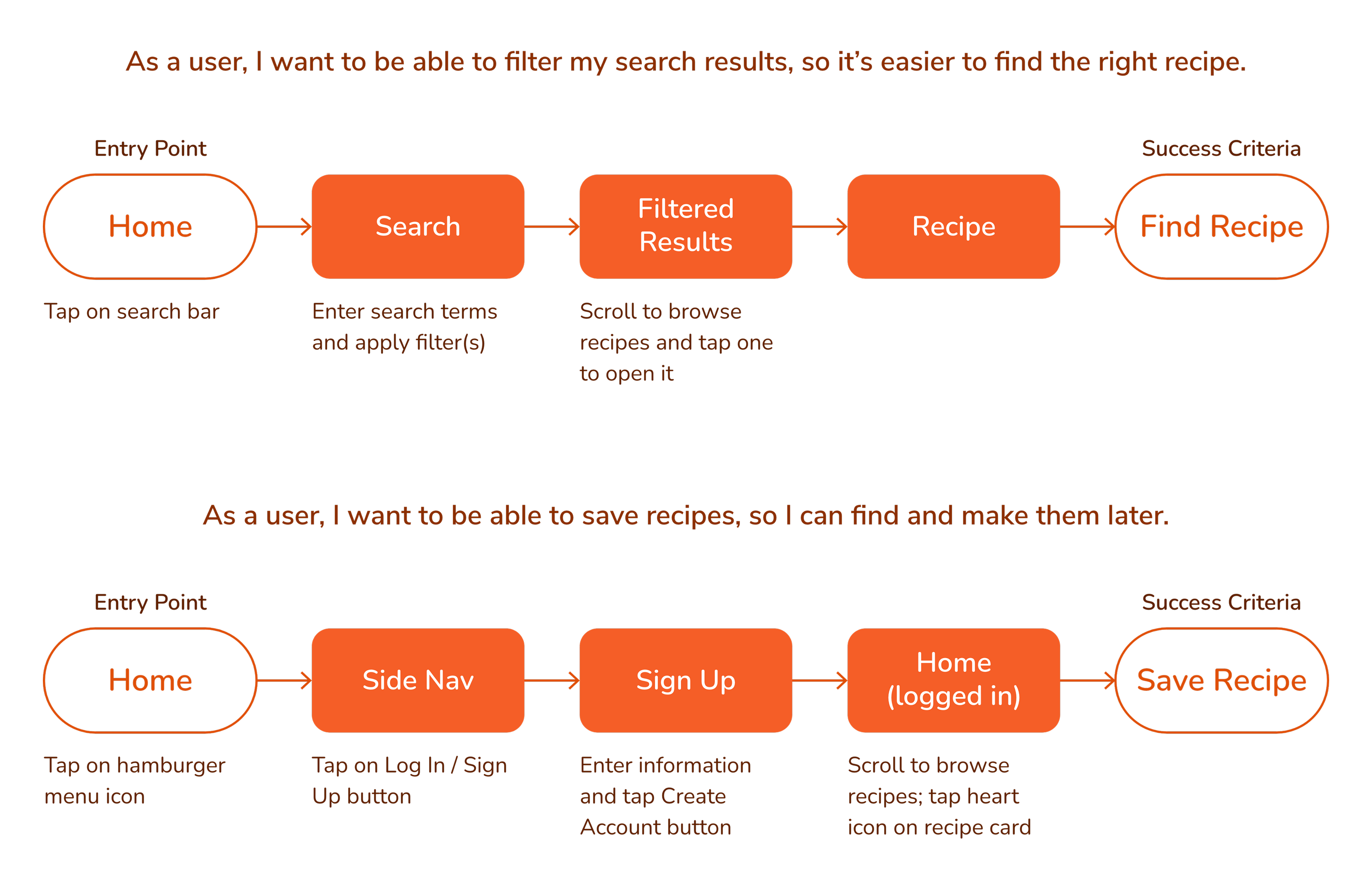
User Flows
Before I began developing screen layouts, I established the various paths that a user may take when trying to accomplish their goals within the app. I did a task analysis and then mapped out the user flows.
From Rough Sketches to Wireframes
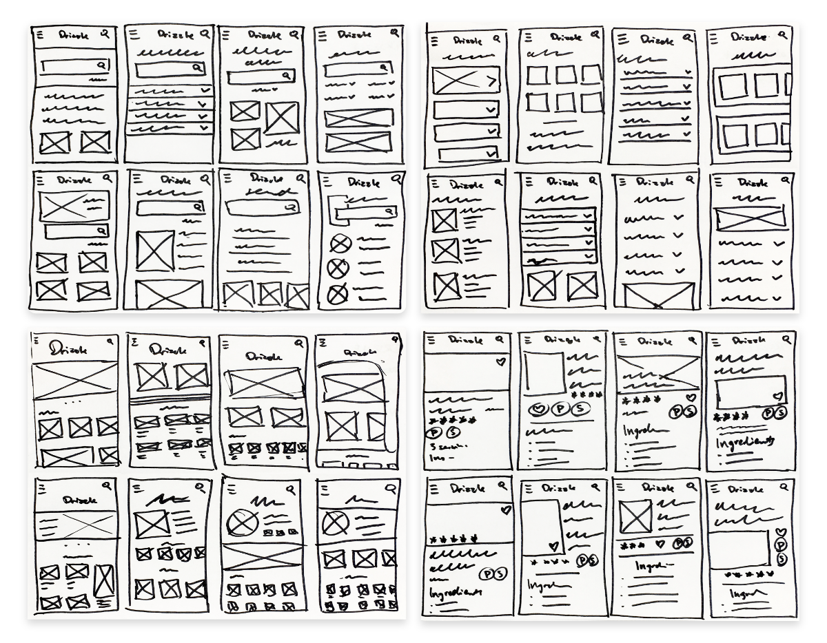
Sketches
During the early sketching phase, I used the Crazy 8s rapid sketching method to get a bunch of ideas down on paper before refining them later.
Wireframes
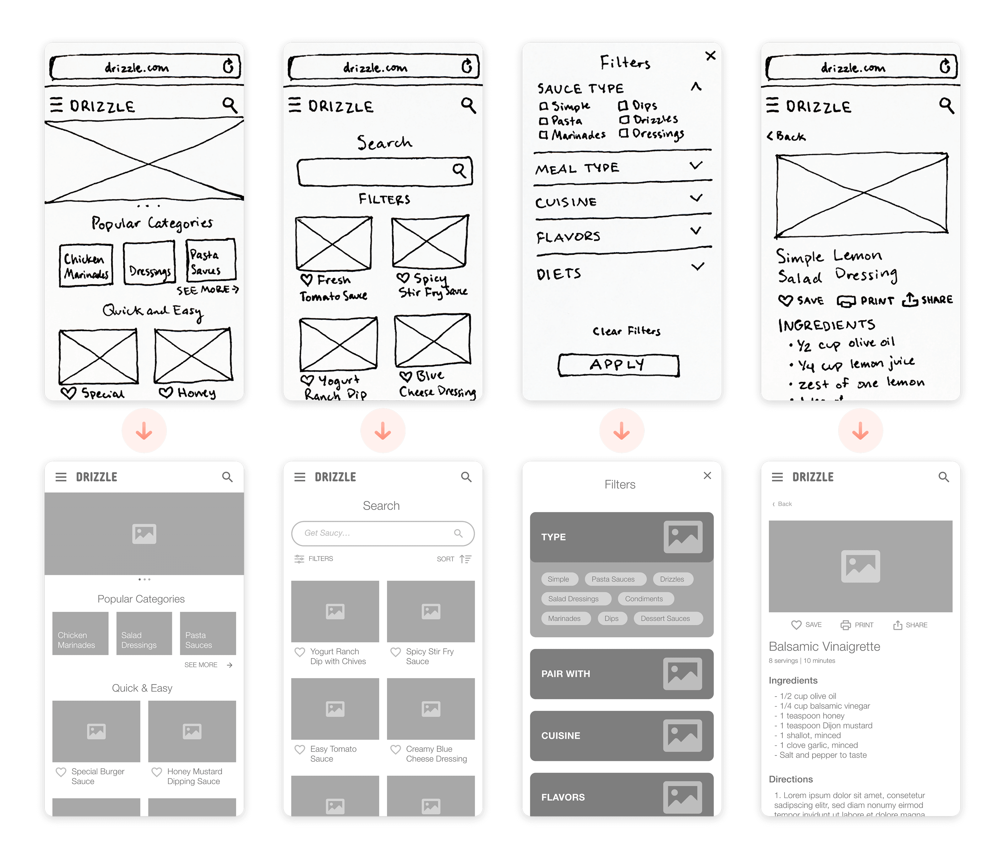
After creating many rough sketches, I chose the strongest layout for each screen and then refined it. I turned the polished sketches into a rapid prototype and did some early user testing.
I used insights from testing to improve the UX structure and flow as I turned my sketches into low-fidelity digital wireframes.
Going High Fidelity
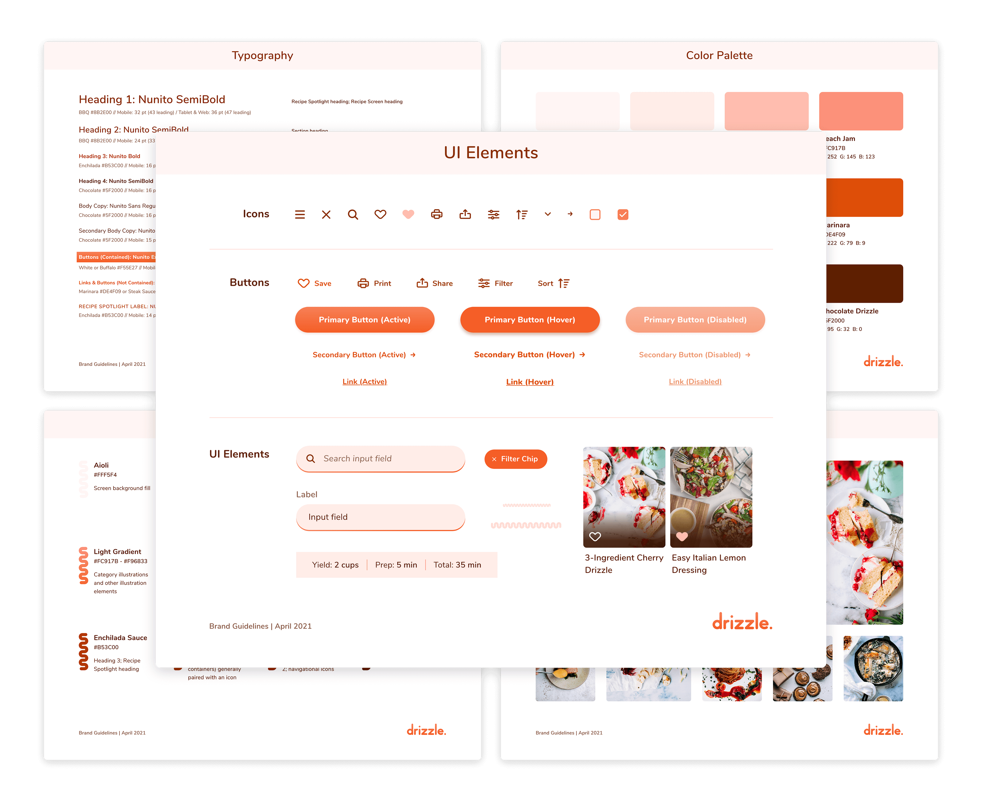
Style Guide
I created a UI style guide for Drizzle to help me maintain consistency across all screens and breakpoints. View the full style guide document PDF.
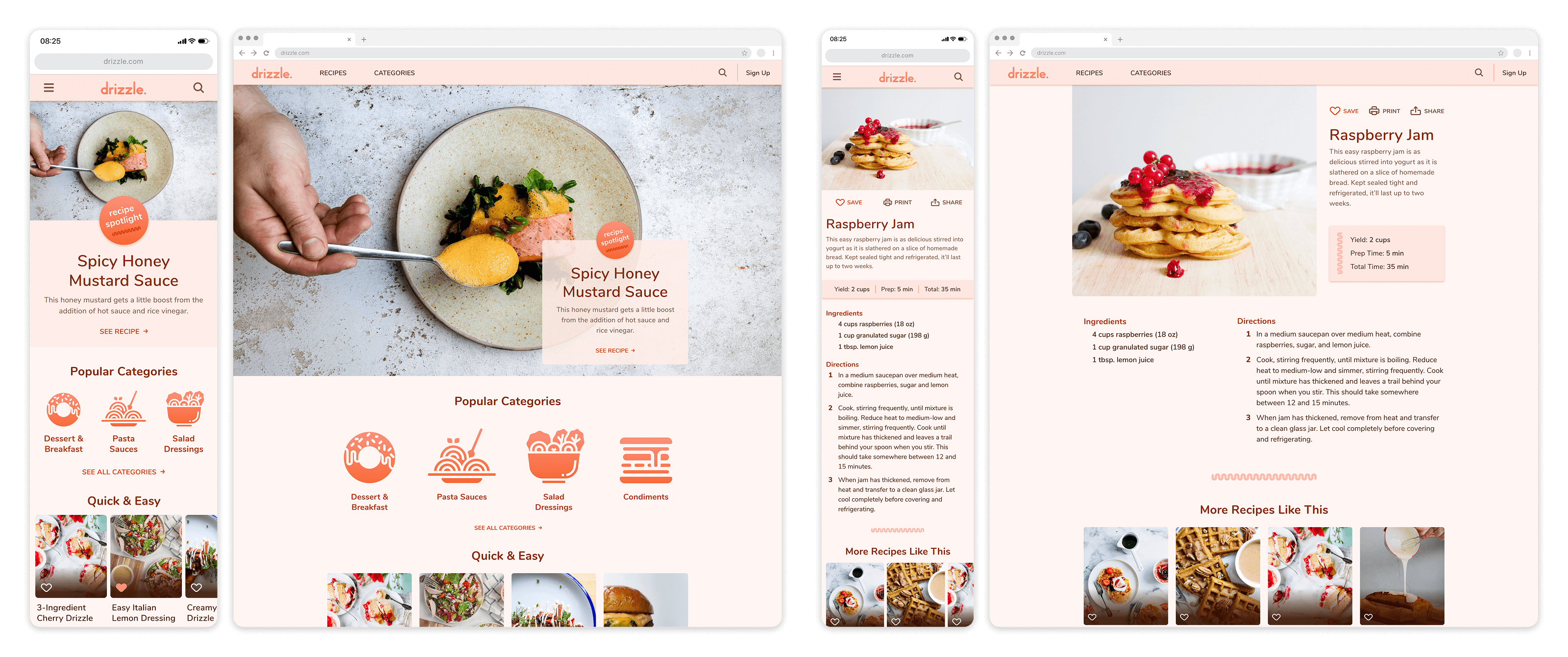
My Initial Finished Design
Using my style guide, I applied UI styling to all of the screens. This was an iterative process; I took each screen through a number of changes, prompted by feedback from peers and my mentor, as I developed the final designs.
Redesign
Accessibility & Visual Design Improvements
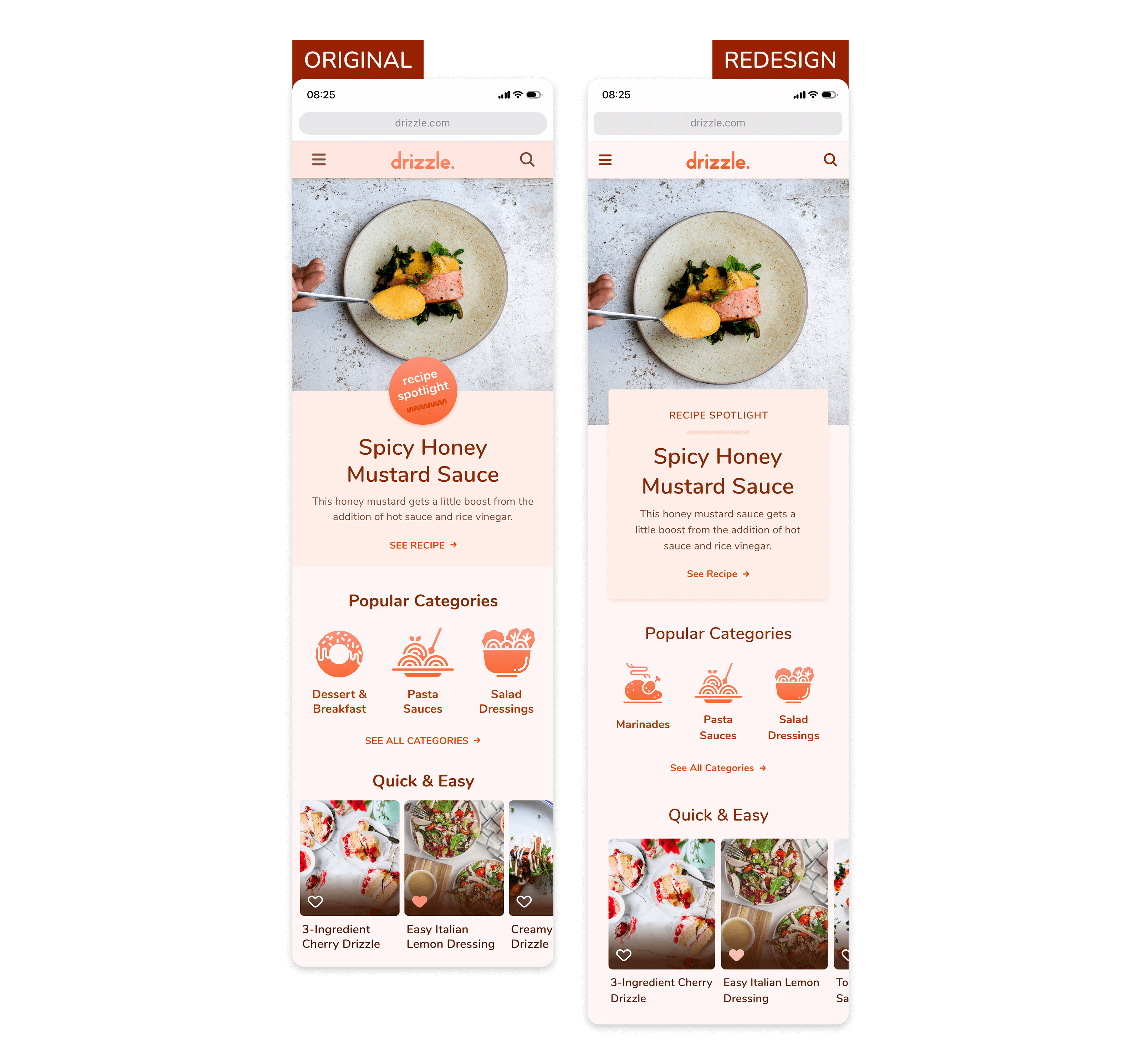
I created Drizzle before I knew anything about inclusive design. As I prepared my portfolio, I went back to Drizzle and realized that the color contrast needed some work. I tried to tweak the colors a bit, but it was not enough; the design needed extensive changes.
Looking at Drizzle with fresh eyes and a few more projects under my belt, I saw several opportunities to improve the product's UI in a myriad of ways. I increased the margins, gutters, and general spacing and made other changes to refine the layout.
Prototype
Reflections
My biggest takeaway from this project is that designing for accessibility doesn't mean disregarding the visual aesthetic. It means opening my mind, seeing things differently, and being even more creative when thinking about solving the problem. It also means being willing to let go of my initial ideas of what the “perfect UI” looks like.
Before I started the redesign, I loved my color palette, and the idea of changing it was a little painful. Comparing the before and after, I can confidently say that the updated UI is more visually engaging.